
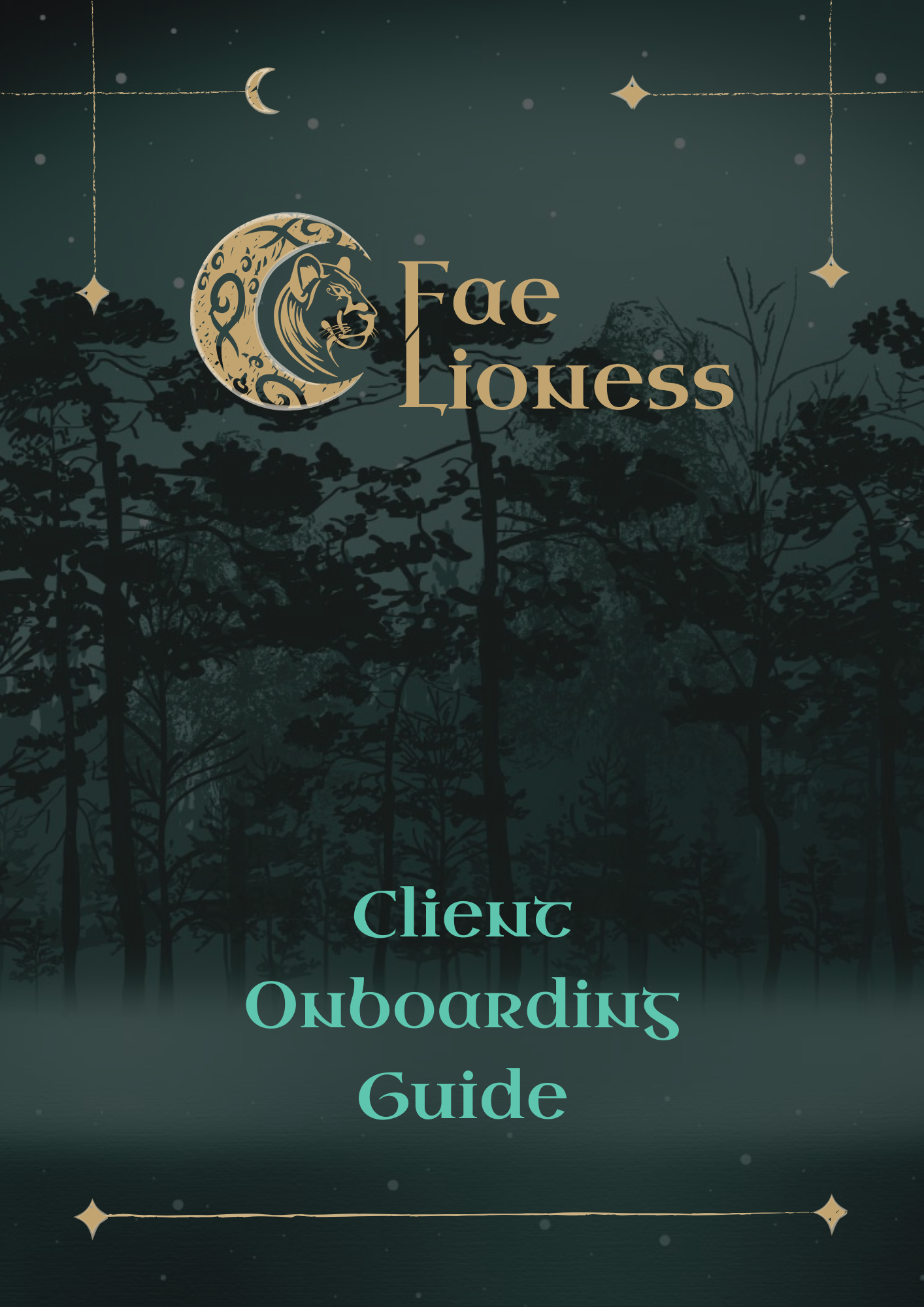
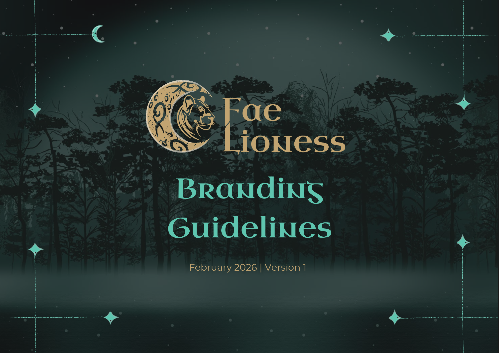
Fae Lioness
“Like Walking Into a Branded Room”
Brand Identity for Kiri — Fae Lioness
The Client
Kiri is a lot of things at once - and that's exactly what makes her brilliant. She works with Discord servers, creating safe, welcoming community spaces. She has a deep connection with Egypt and the goddess Sekhmet. She's a technowitch with a goth sensibility and a love of all things moon-related. And she had one absolute non-negotiable going into this project: her paw print tattoo had to be in the logo.
Everything else was open. Which, for a designer, is both a gift and a challenge.
The Brief
Kiri had seen the brand work I'd done for Alexis Bushnell - particularly the stickers - and knew she wanted something similar for her own brand. A full identity for Fae Lioness that captured all of who she is: the Egyptian mythology, the witchy aesthetic, the goth edge, the community warmth. And those stickers.
We started with a 90-minute discovery call where Kiri talked me through her world -the Discord work, the Egypt connection, Sekhmet, the technowitch side, what mattered and why. By the end of that call, ideas were already starting to flow.
The Process
Kiri's Notion board was filled with detail - so much detail that narrowing it down was the real challenge. I created two slightly different moodboard directions and sent them over. She loved both, which was equal parts wonderful and tricky. So we did what made sense: picked the elements she loved most from each, merged them into one direction, and made sure she was happy before I put pen to paper.
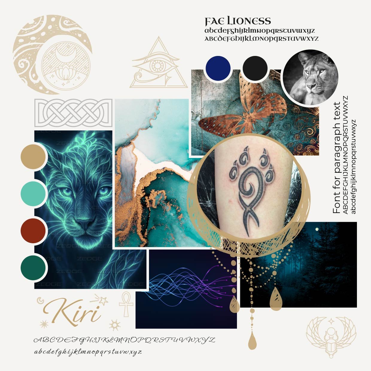
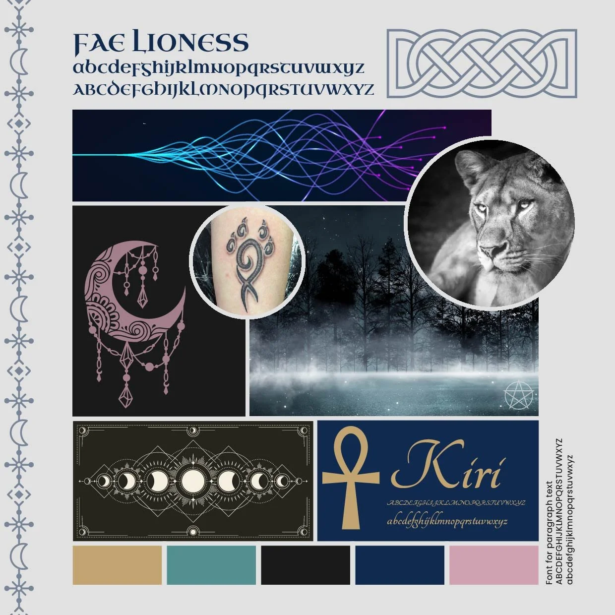
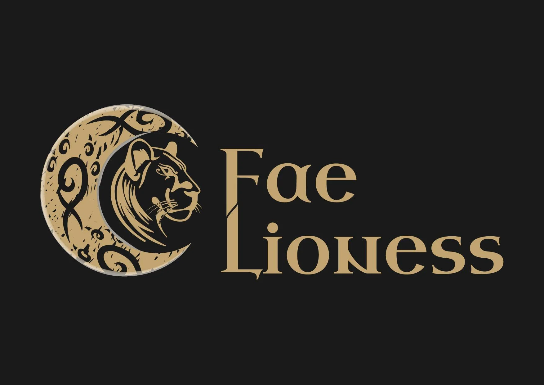
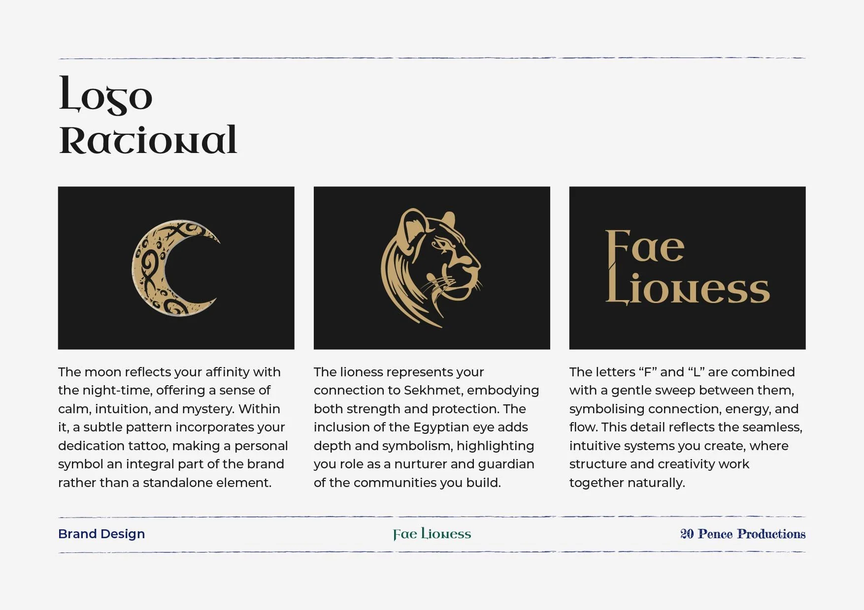
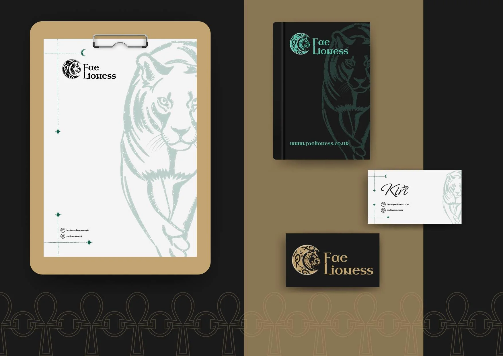
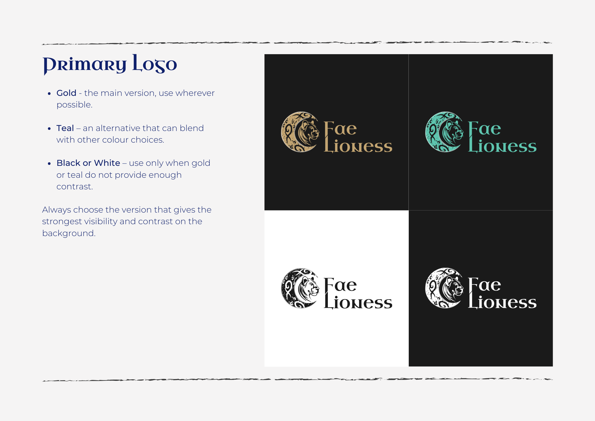
The logo was where I spent the most time. The paw print was non-negotiable, but working out how to use it took some experimenting. Everything felt a bit clunky at first - until I tried using the paw print as a repeating pattern on a textured moon shape. Kiri had mentioned she was more of a night person than a sun person, and there had been some beautifully textured moons on the moodboard. That felt right.
I linked the F and L of Fae Lioness together with a flowing line between them, then turned my attention to the lion. I wrestled with it for a while - was a lion too obvious? But knowing how central Sekhmet was to Kiri, I decided to give it a proper go. I worked on it, added an Egyptian eye which looked good, played with a part-moon shape for flow - but something still wasn't quite landing. I stepped away, came back, and added what I can only describe as a swoosh. Yes, very technical. But it gave the design exactly what it needed.
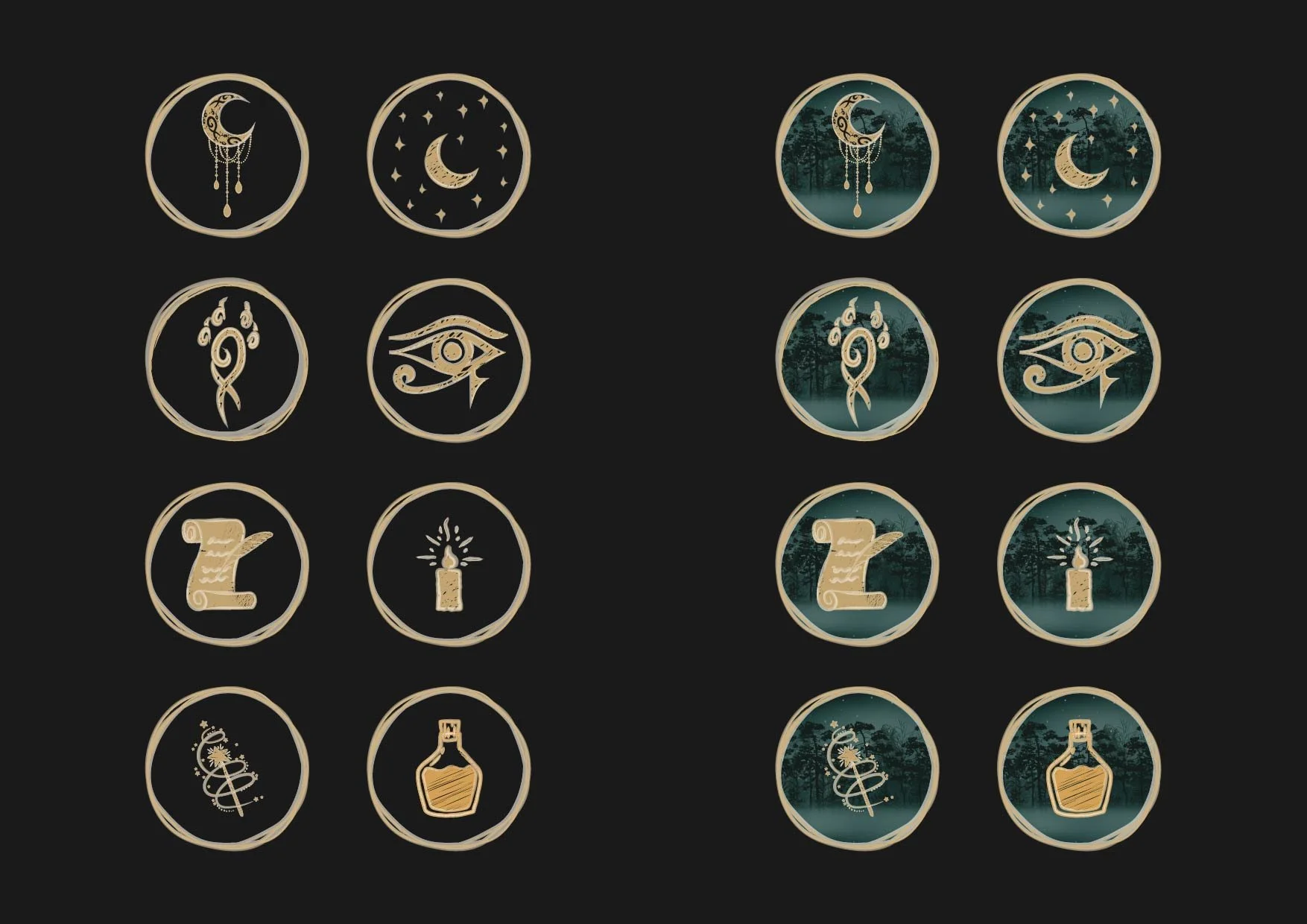
Then came the wider brand elements - moon shapes, witchy details, Egyptian motifs. I came back to it every day, adding a little more. And then I hit a wall. Not a creative block exactly - more like too many ideas with no clear way through. So I did what I always do when that happens: I got out some paper and felt tips, wrote down everything that was bouncing around in my head, doodled, made notes, mapped out different directions.
Looking at it all laid out, I realised I wasn't stuck at all. There were just too many good ideas fighting for space. Once I could see them all at once, I could prioritise, focus, and let everything slot into place.
Three weeks of work later, the brand presentation was ready.
The Presentation
Presentation days are always a mix of nerves and excitement. This one especially.
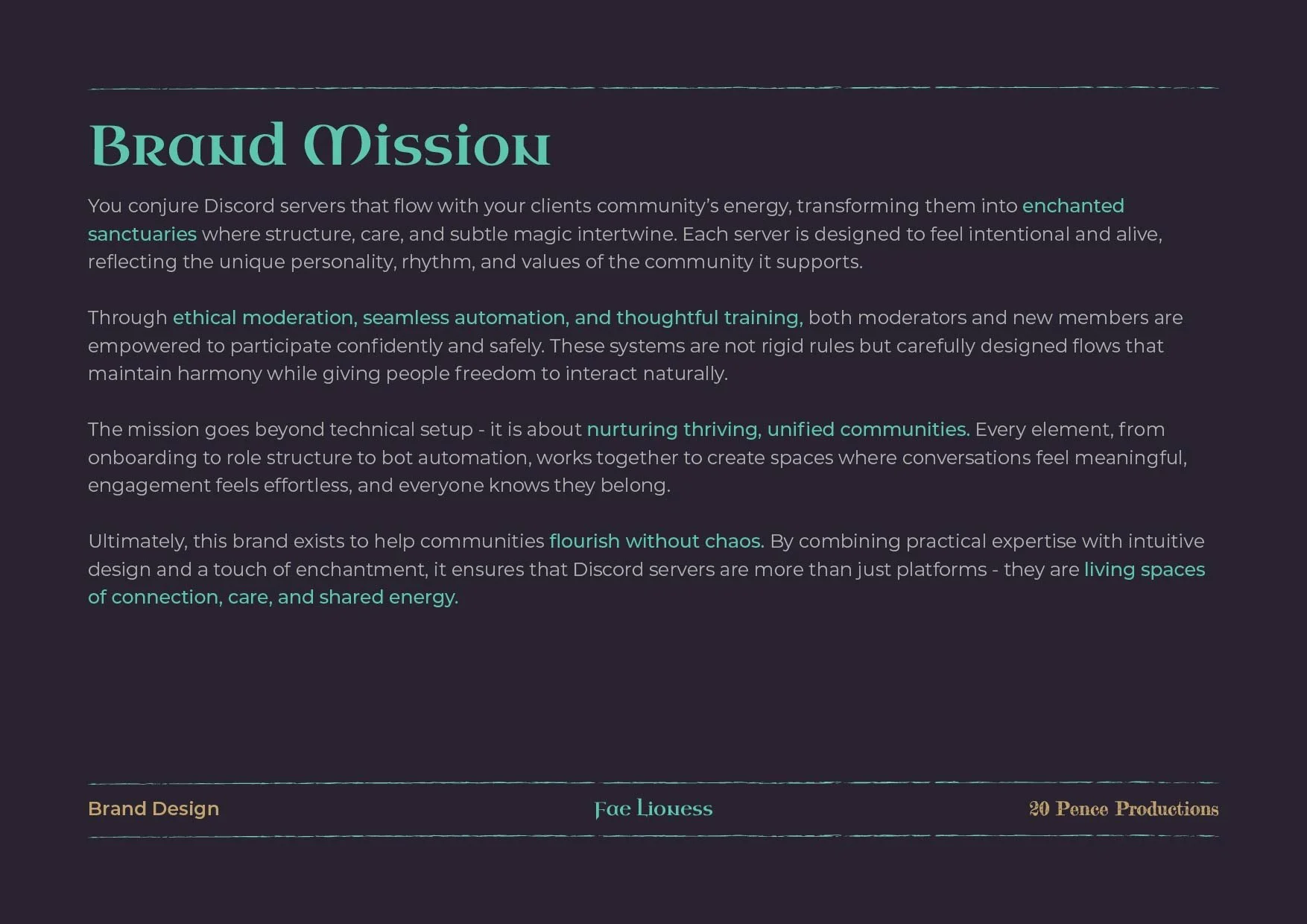
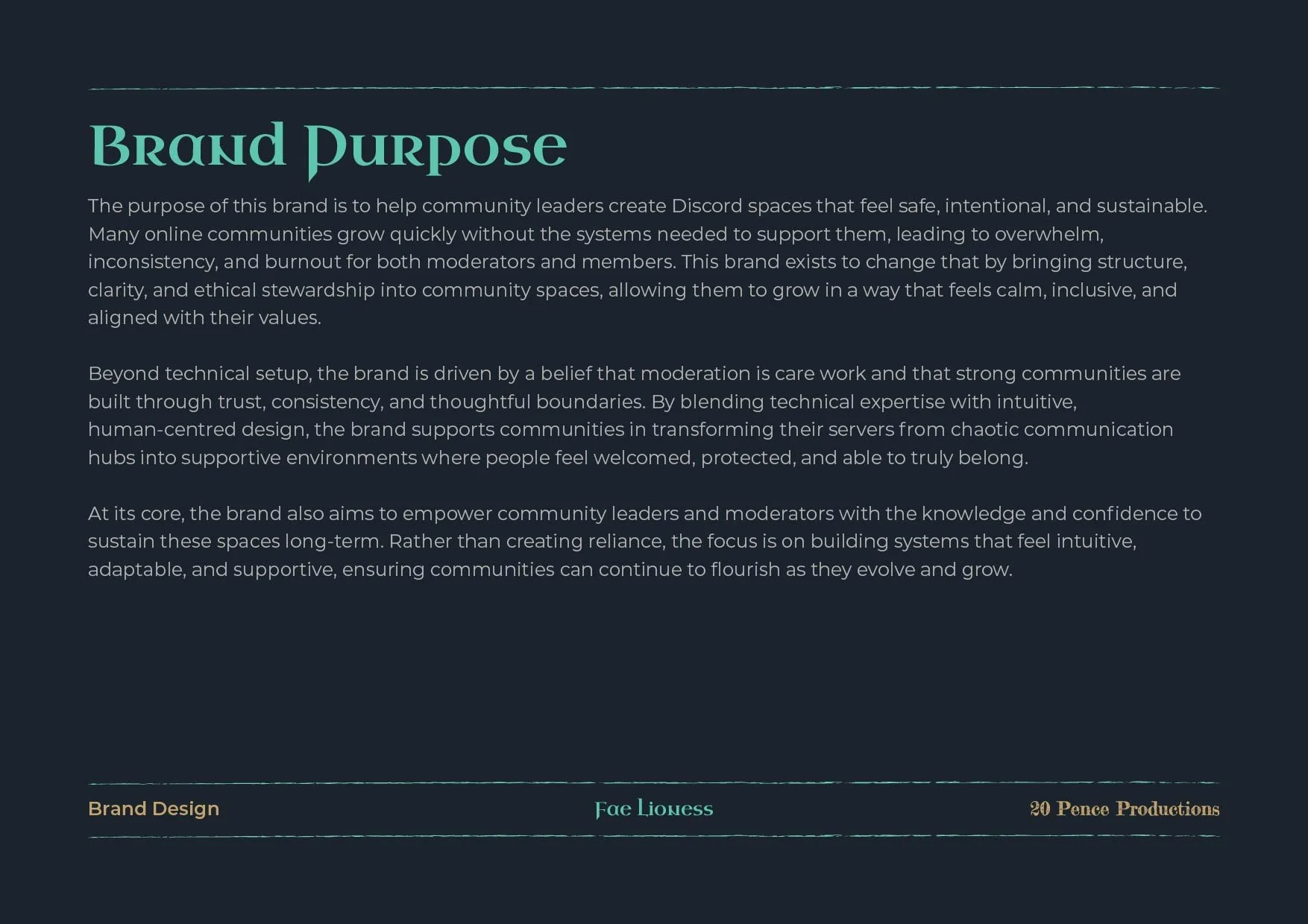
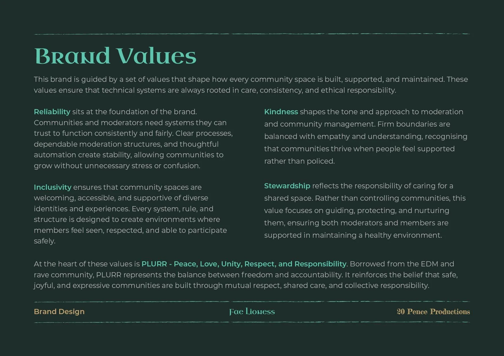
We went through the brand introduction together - mission, purpose, values, all drawn directly from what Kiri had shared. The first few pages had a nod to what was coming, and before we'd even reached the logo she said: “I love it already.”
Then we got to the logo. Full page. And that's when the tears came.
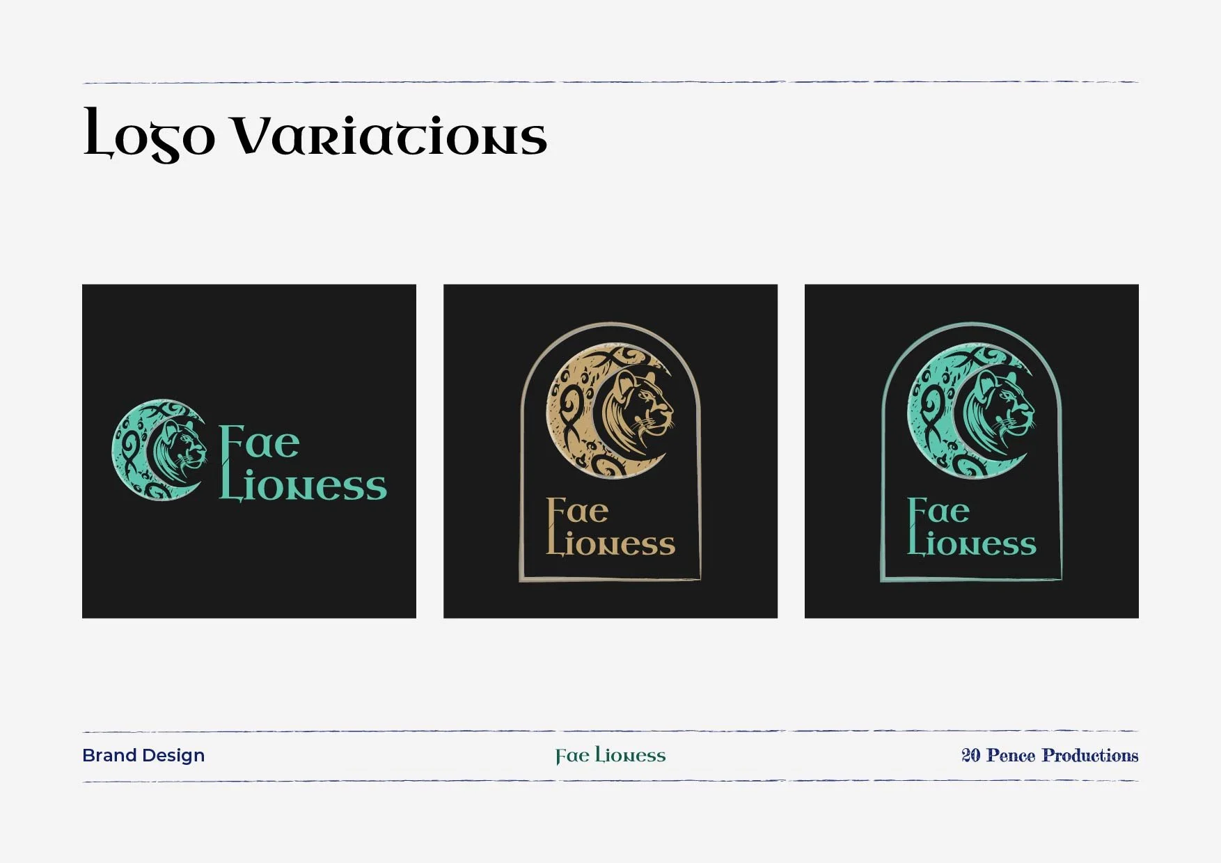
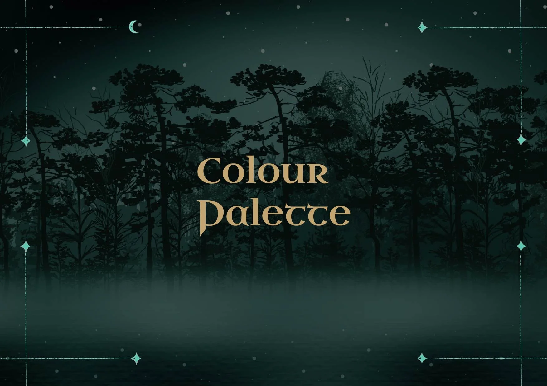
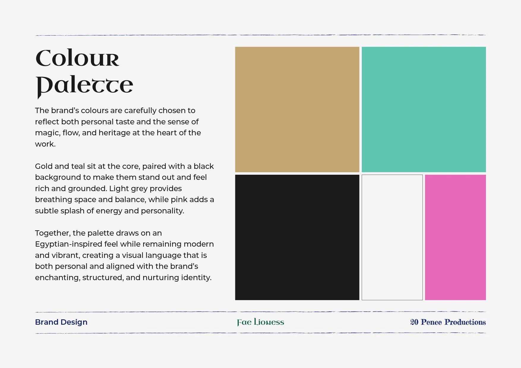
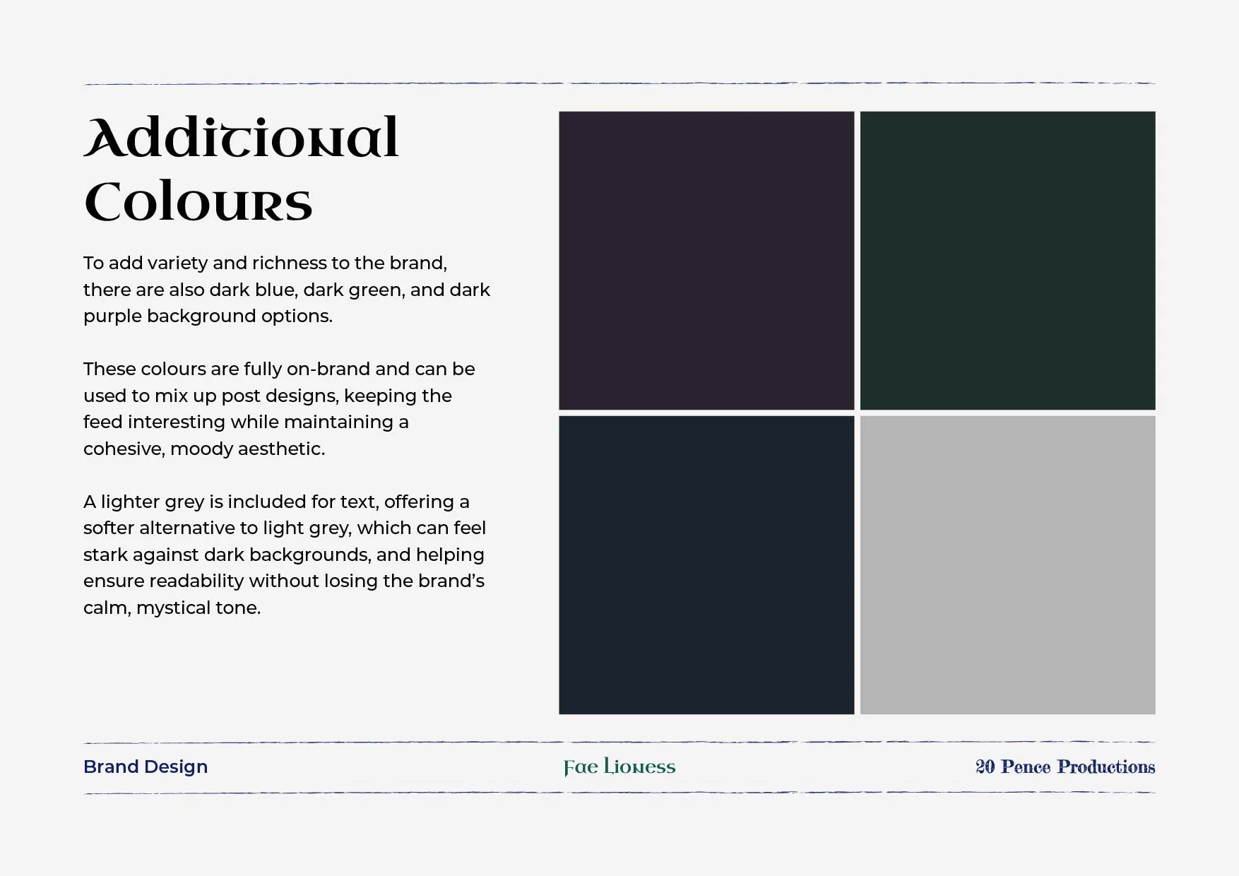
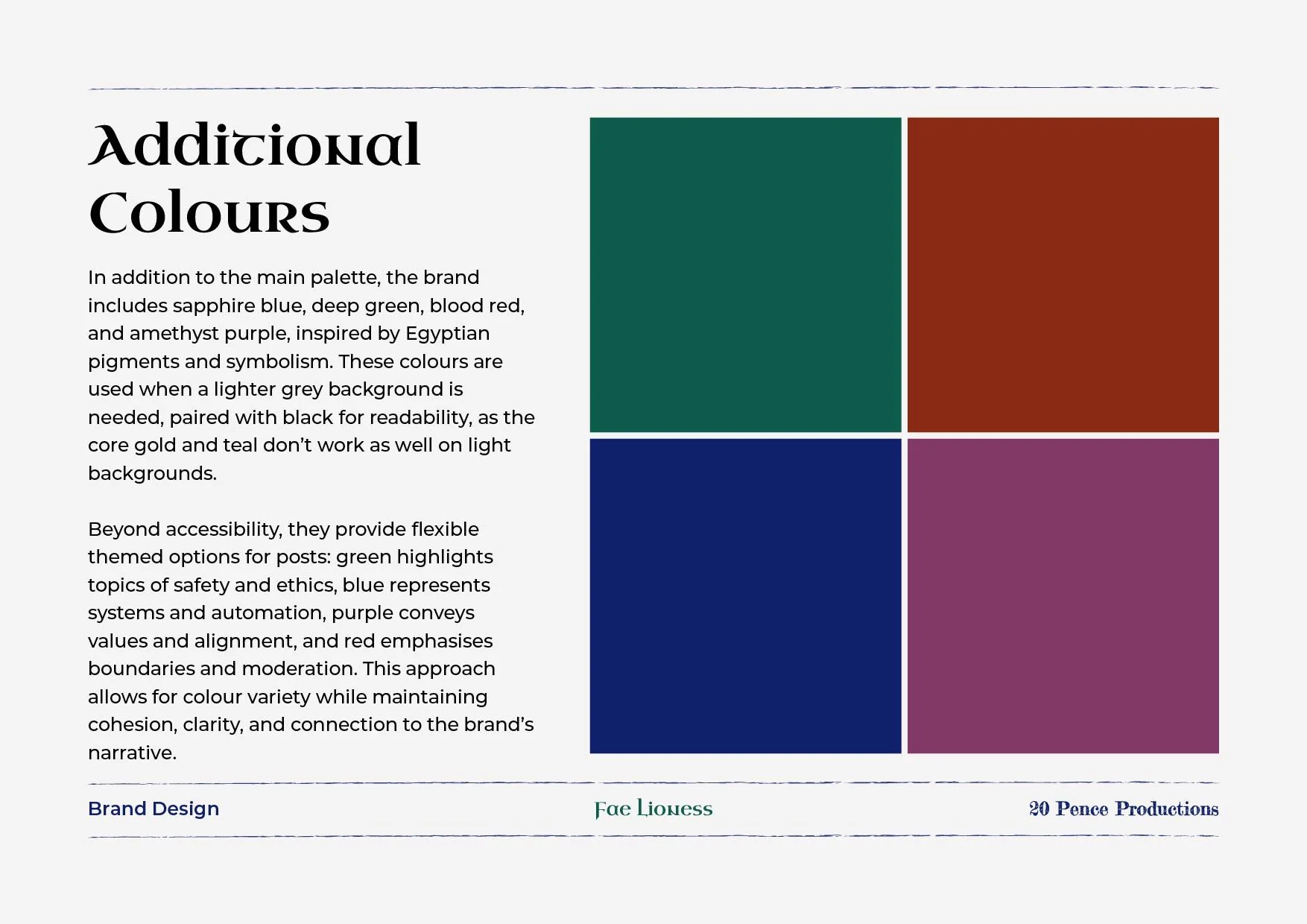
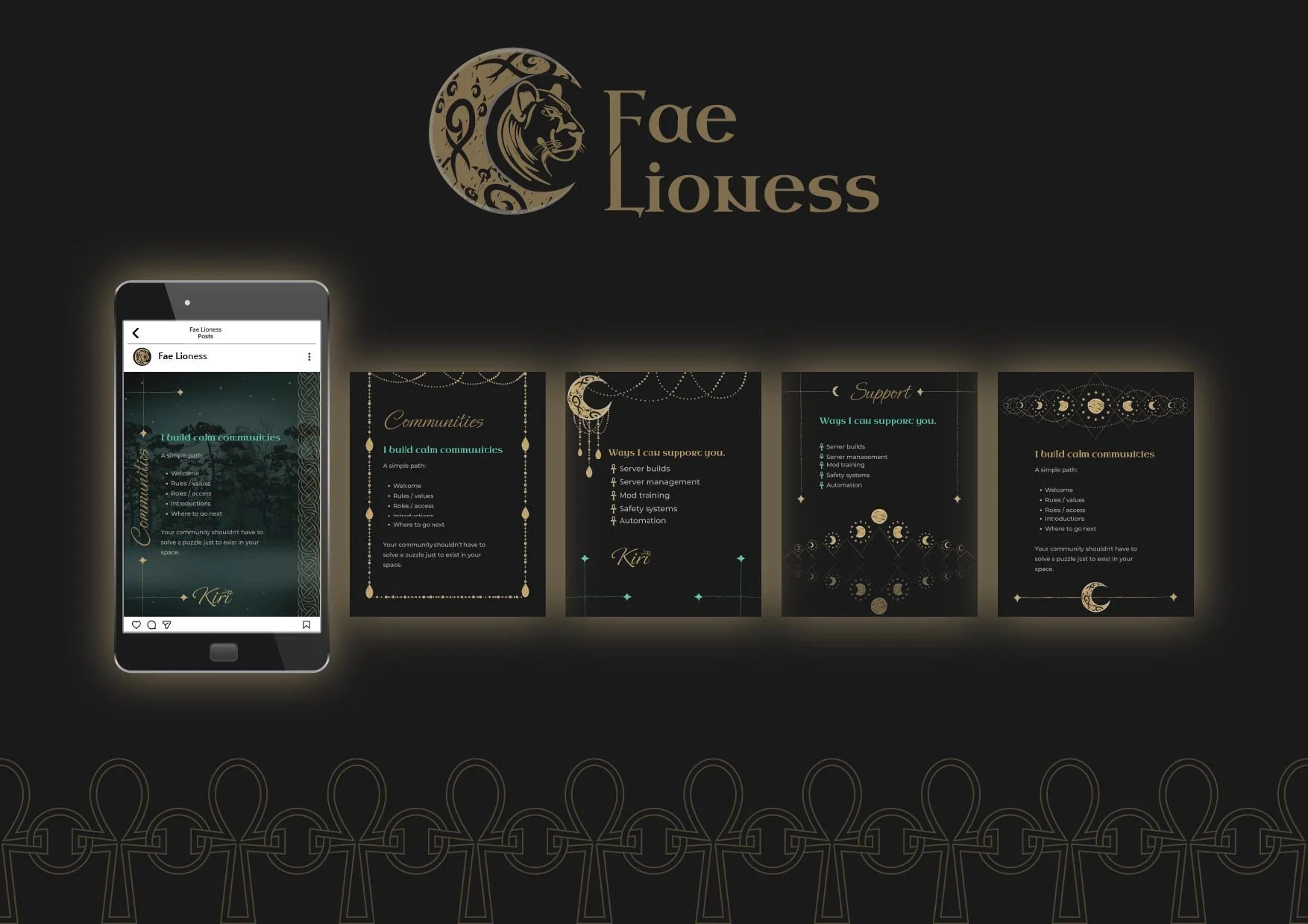
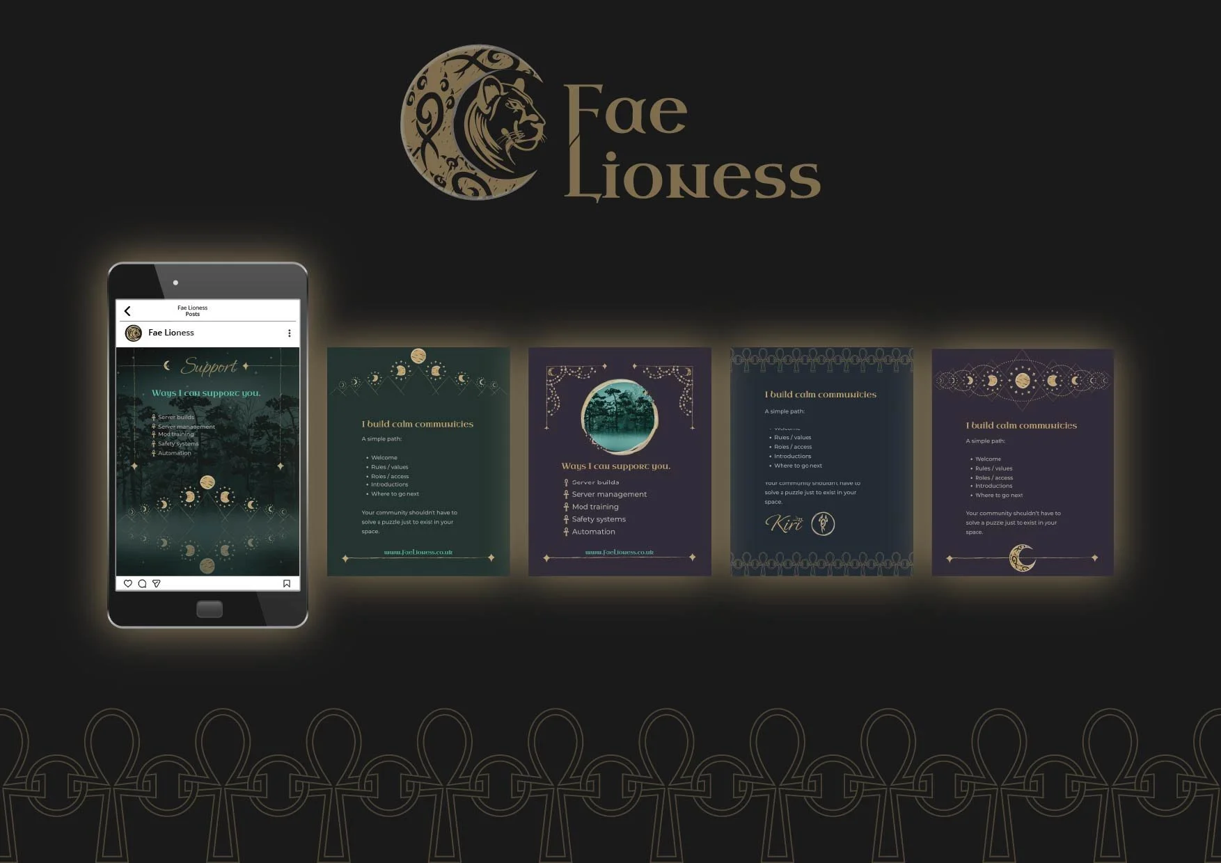
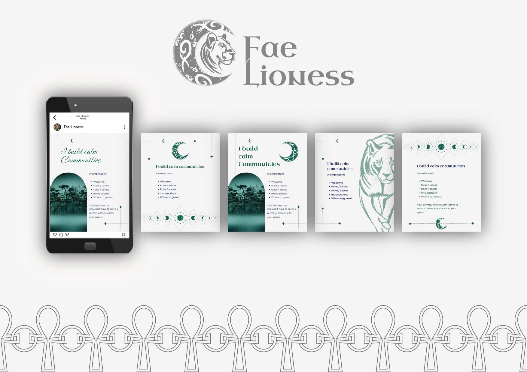
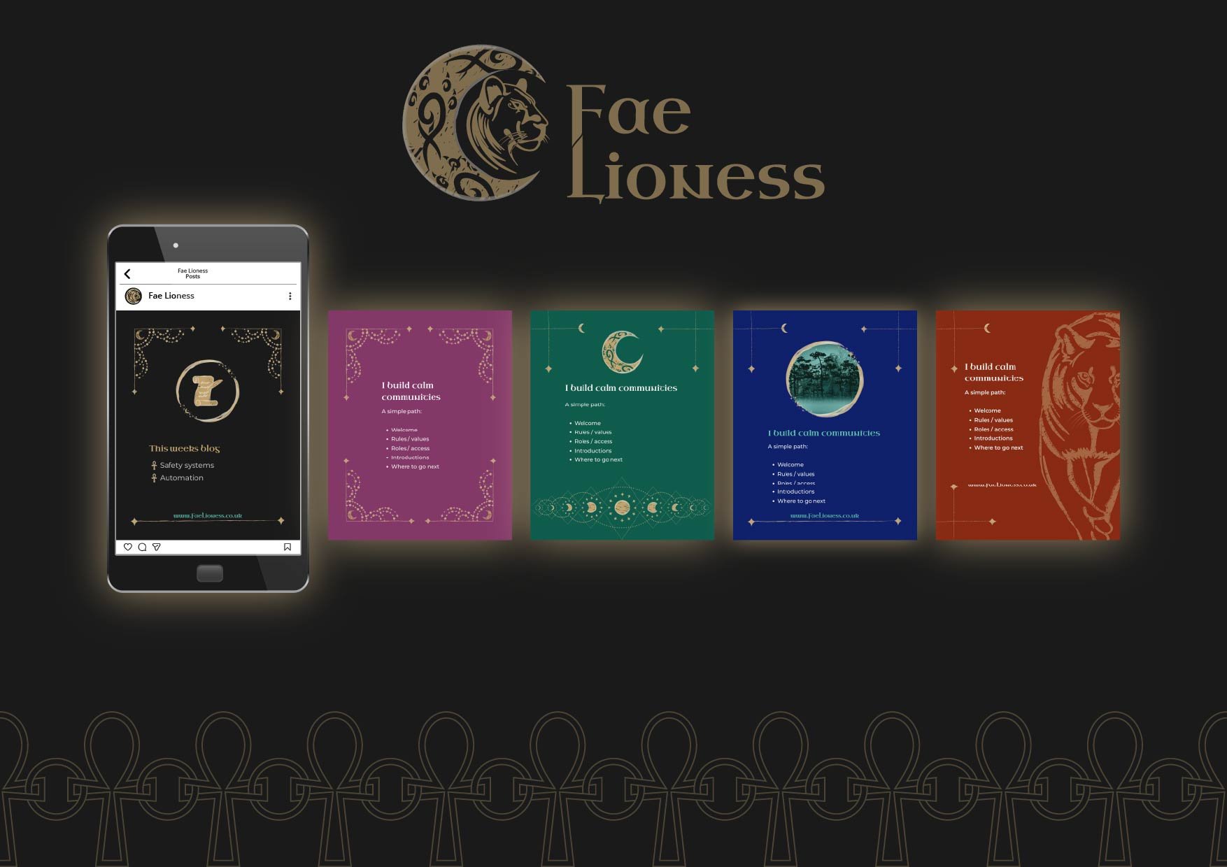
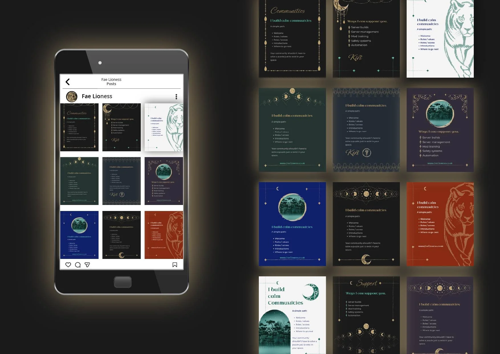
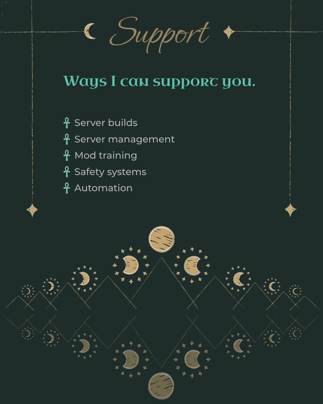
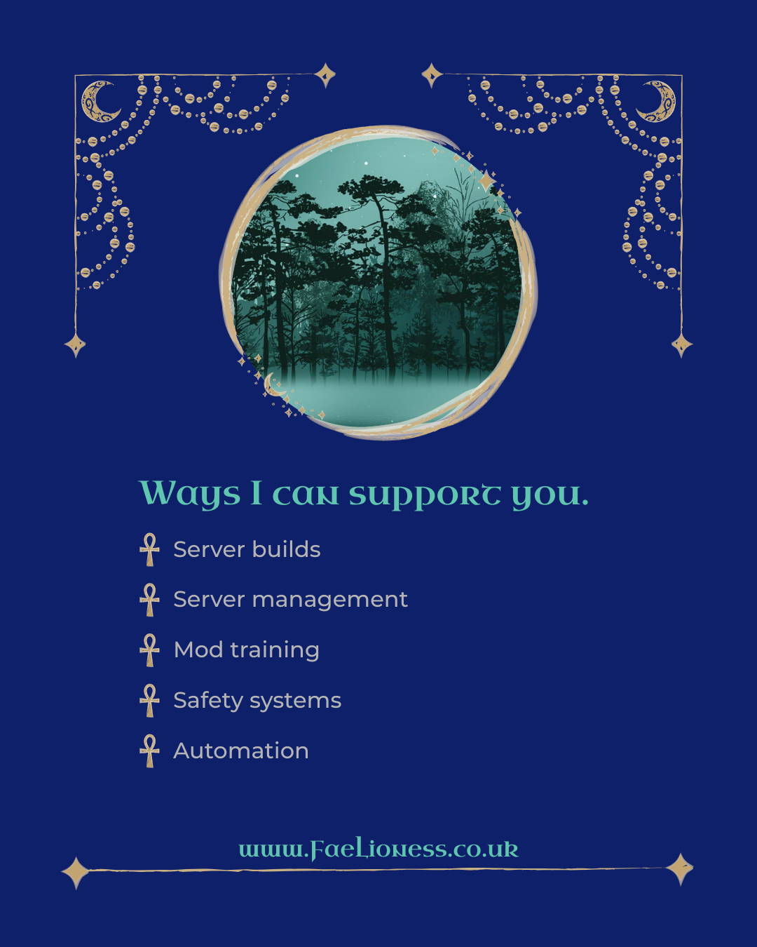
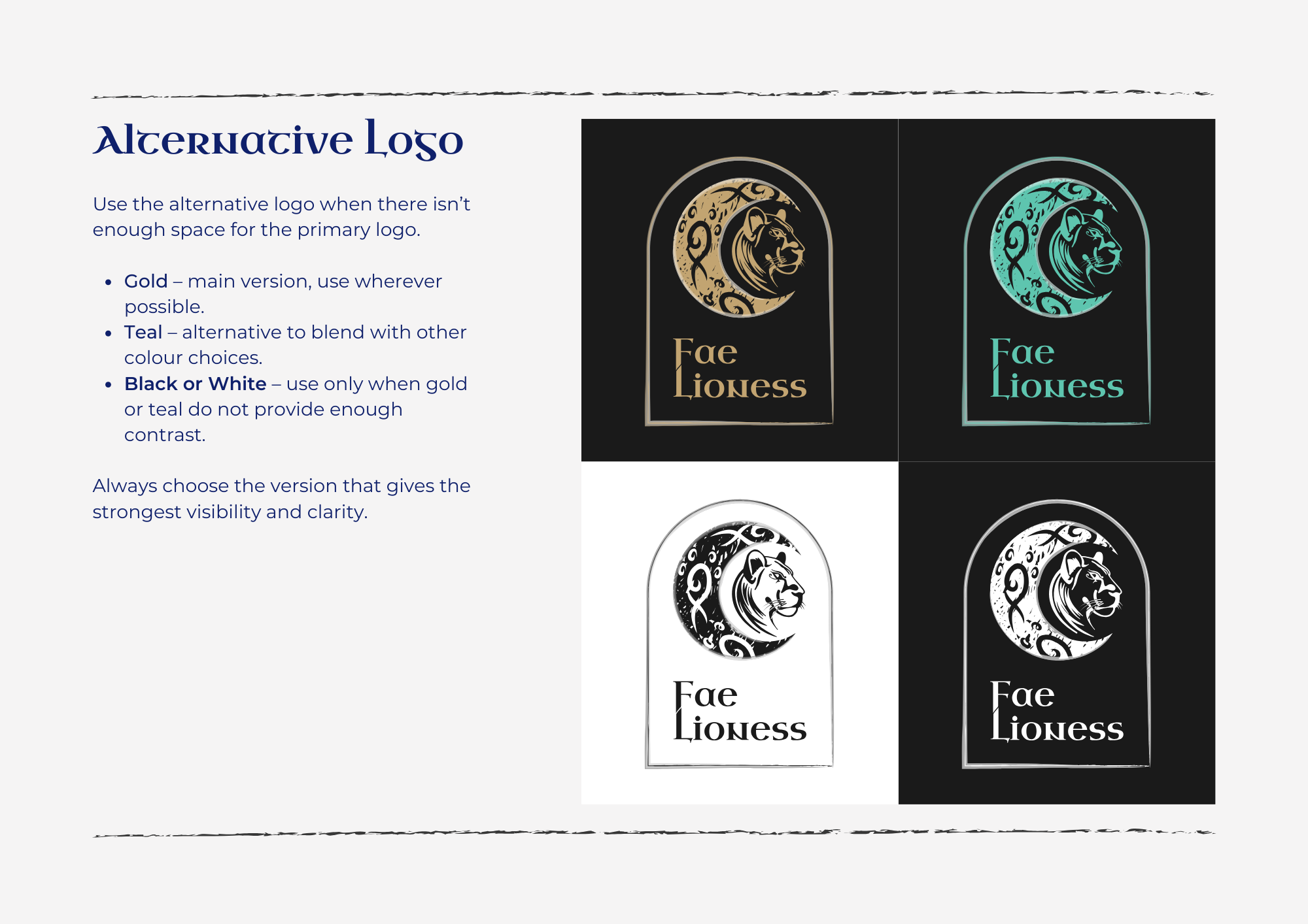
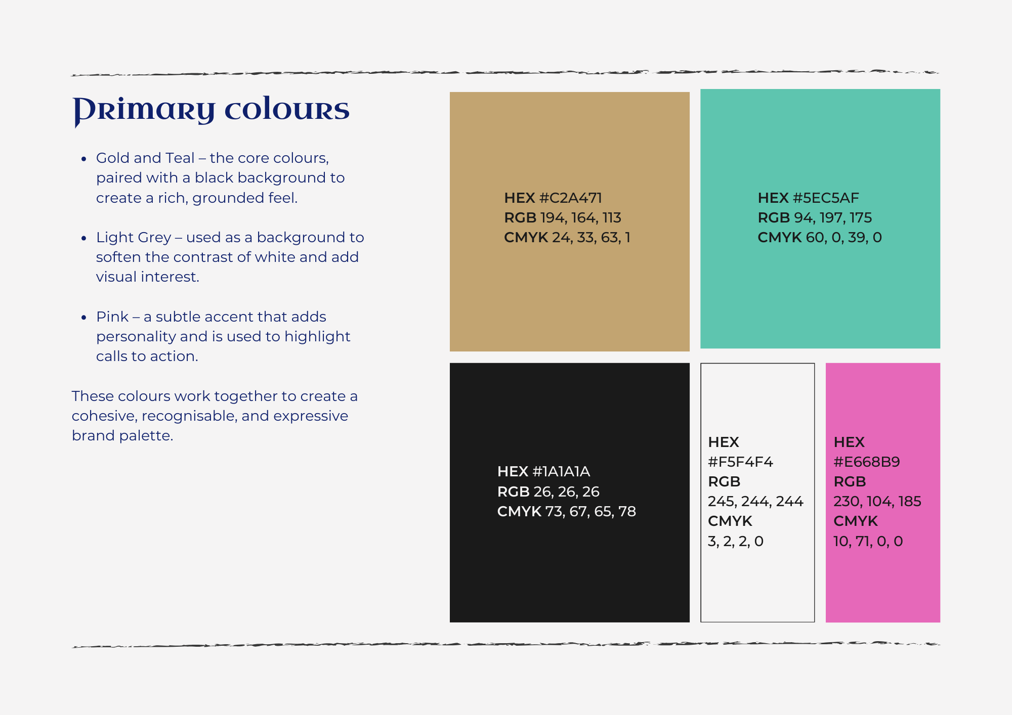
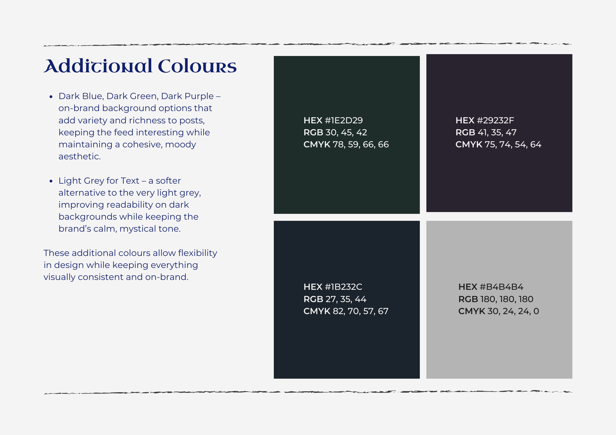
We carried on - through the thinking behind the design, the logo variations, the colour system. Rather than just only black, I'd built a palette including deep greens, purples, and blues, with a lighter option to break things up, and four specific colours for different types of content posts. The idea was to give Kiri genuine creative freedom while keeping a system underneath that made everything feel cohesive and easy to use.
Midway through the call, Kiri said something I won't forget:
"It's like walking into a branded room and it feels like I am home."
There may have been tears on my end too.
She had no amendments there and then. We let it settle for a day or two, made one small tweak.
Then came the build. The brand package itself took a couple of weeks to put together properly - and here's what Kiri walked away with:
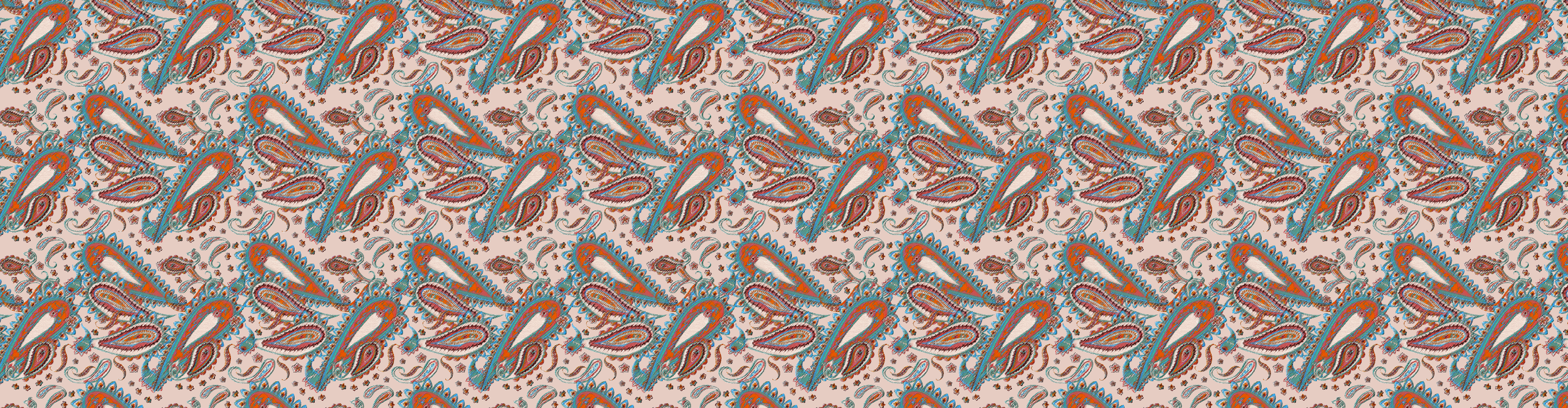
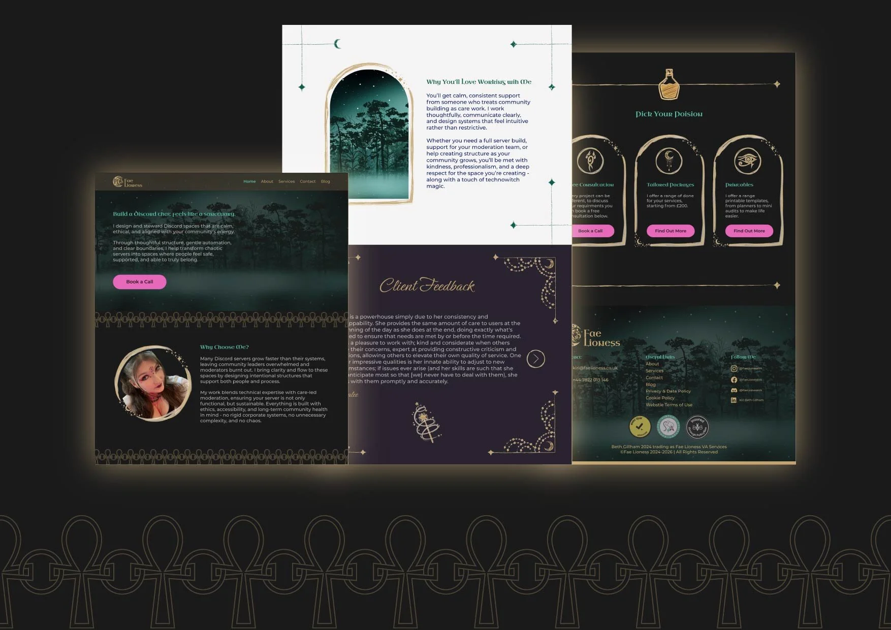
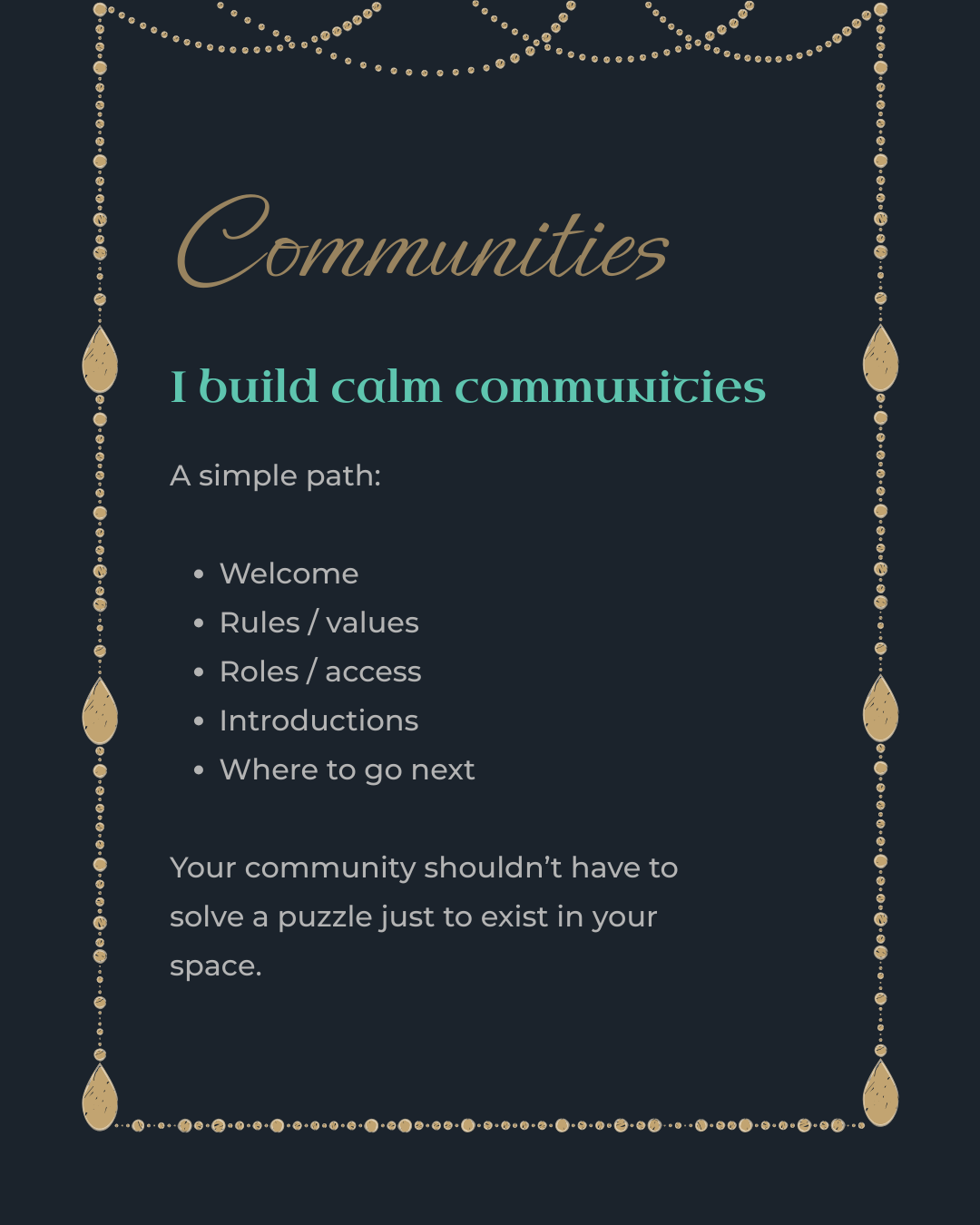
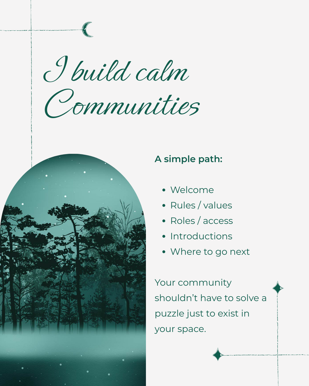
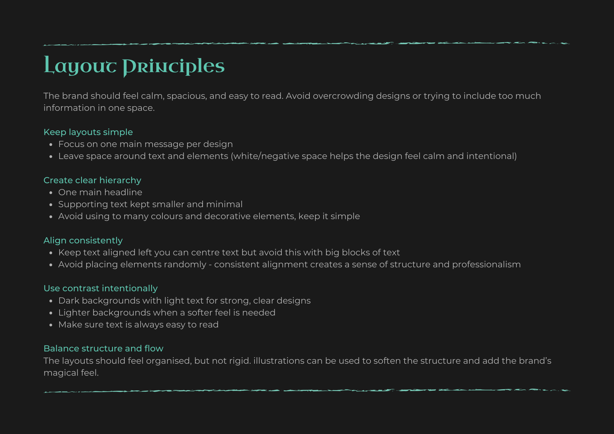
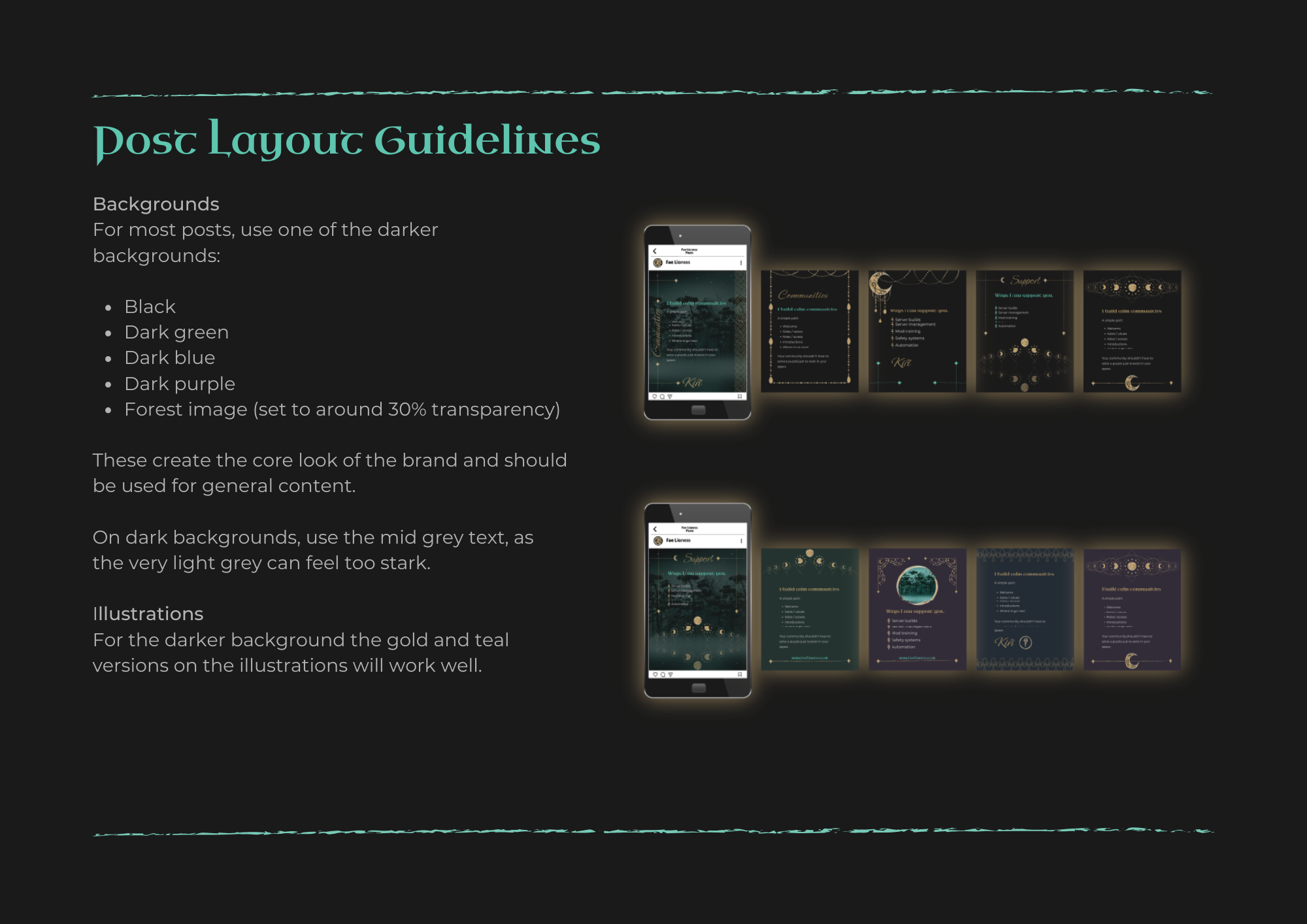
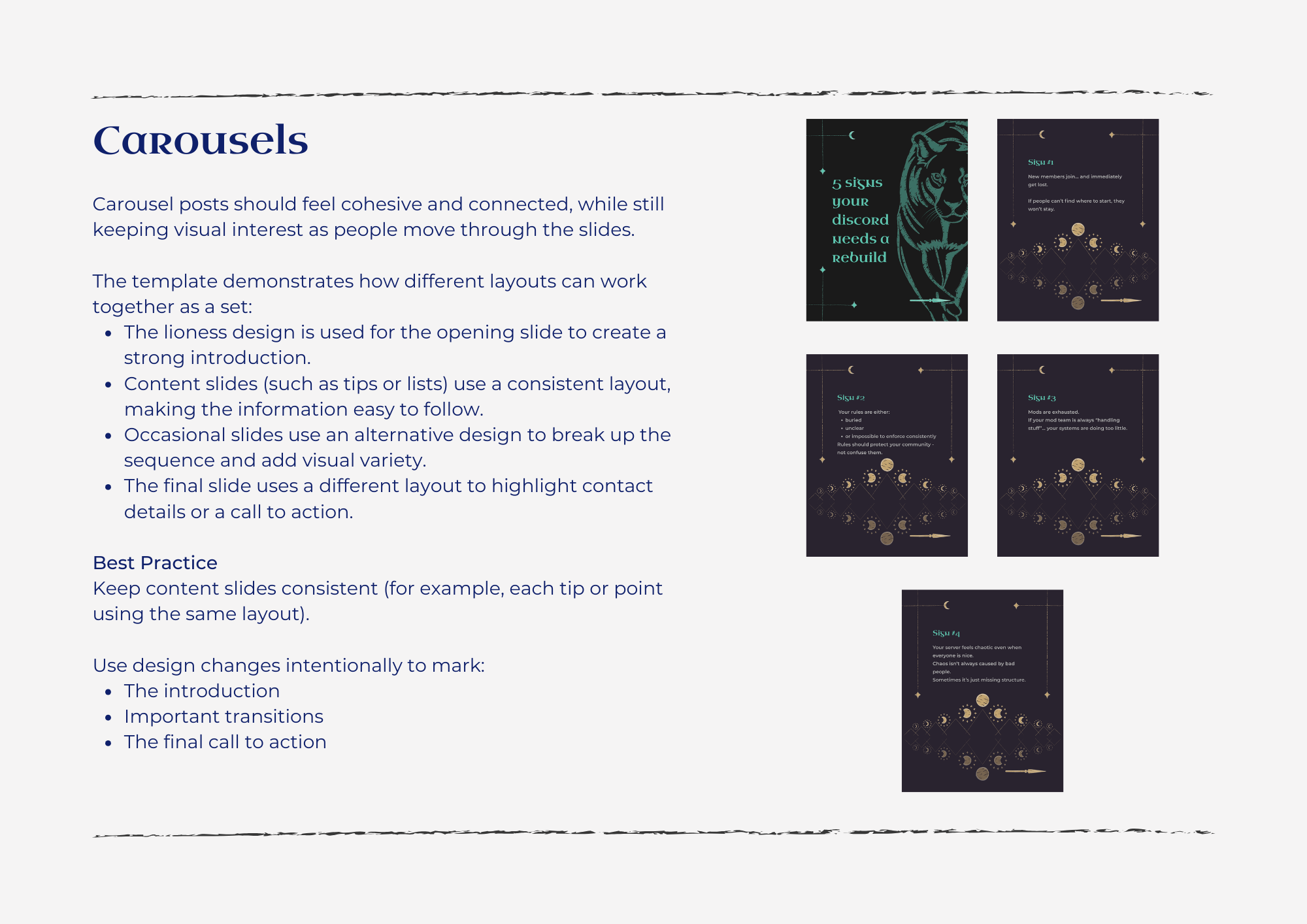
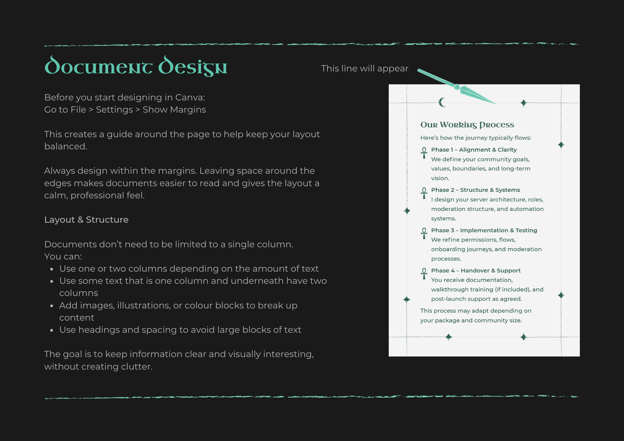
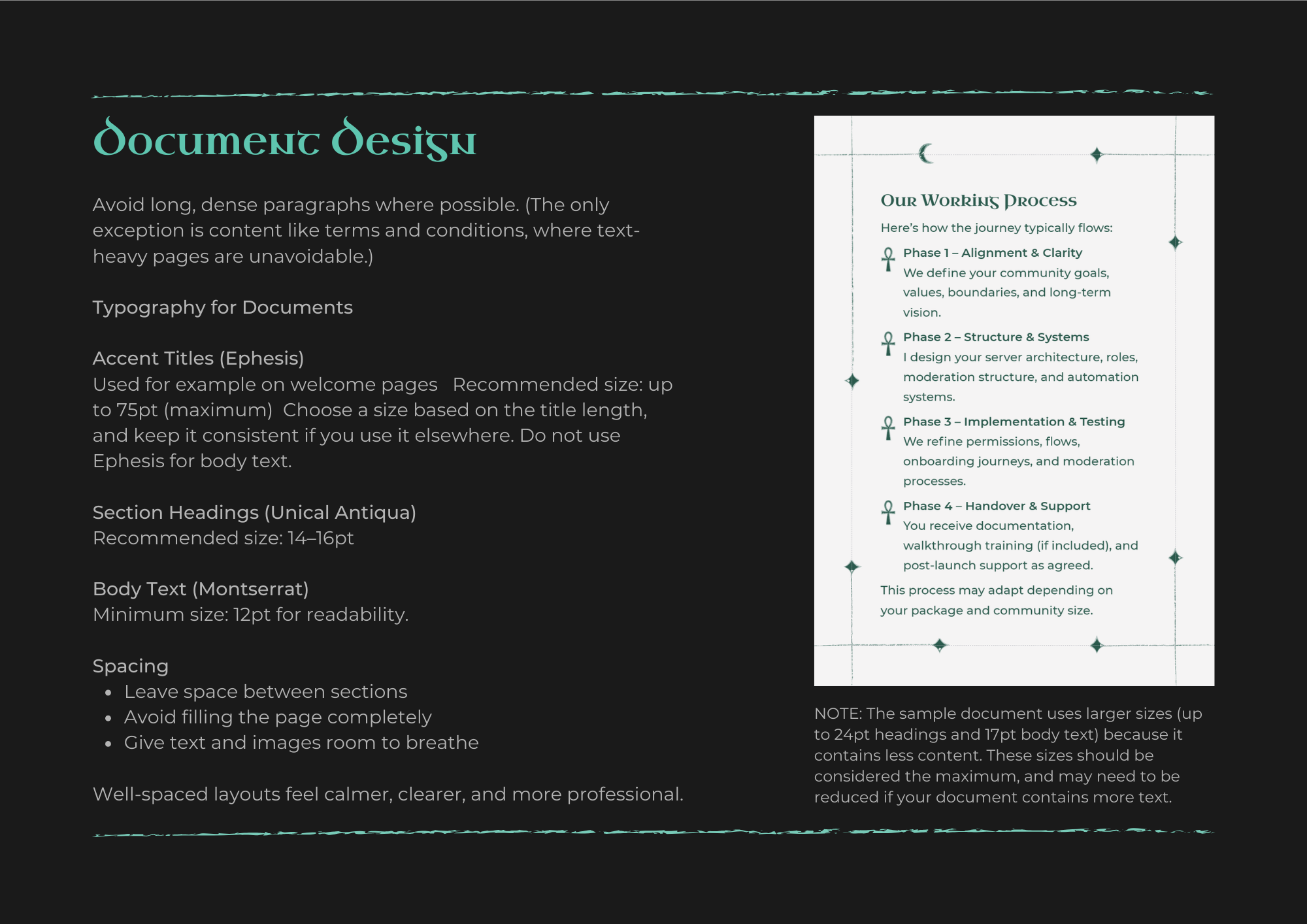
Logo files in print and digital formats, a full set of brand assets including all the patterns and shapes, 12 social media post templates and a carousel, an onboarding document, Facebook and LinkedIn headers, and brand guidelines written in plain English - no corporate speak, just practical advice on layout, design, and what to avoid. The guidelines are built in Canva too, so as Fae Lioness grows there's always room to expand.
Social Media Posts
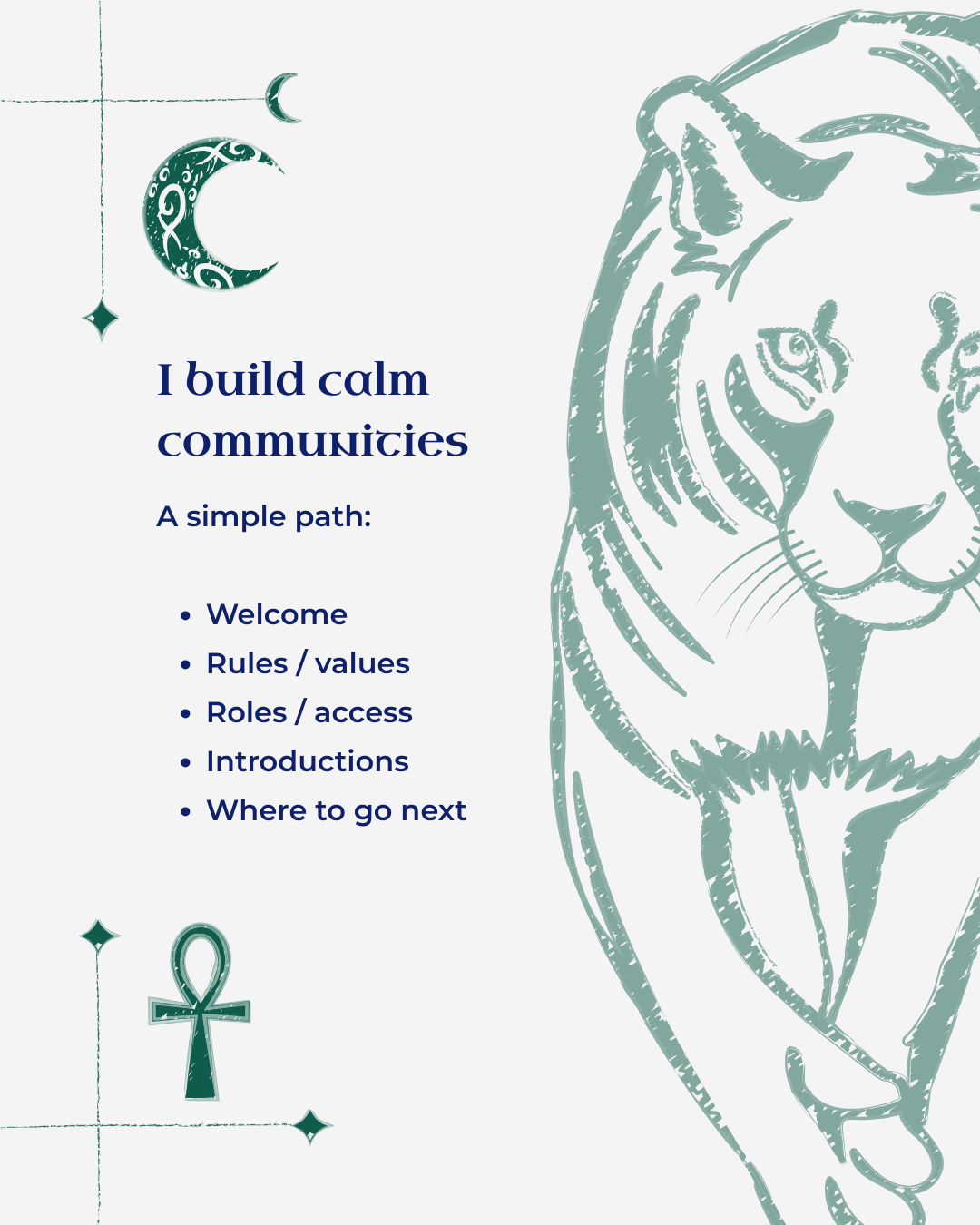
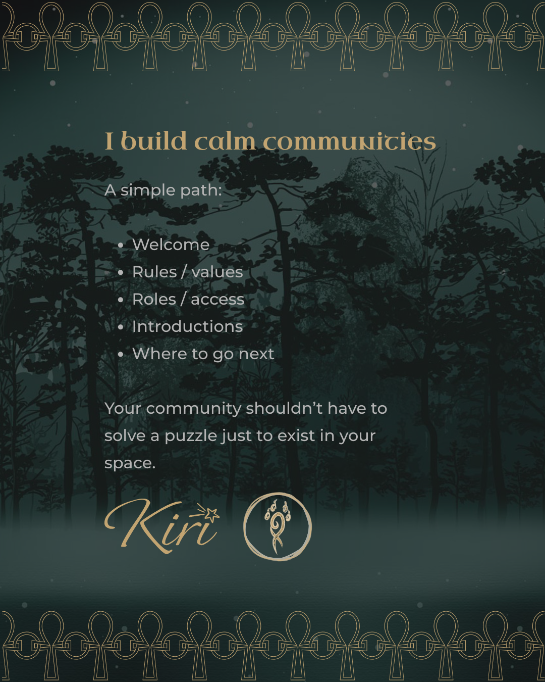
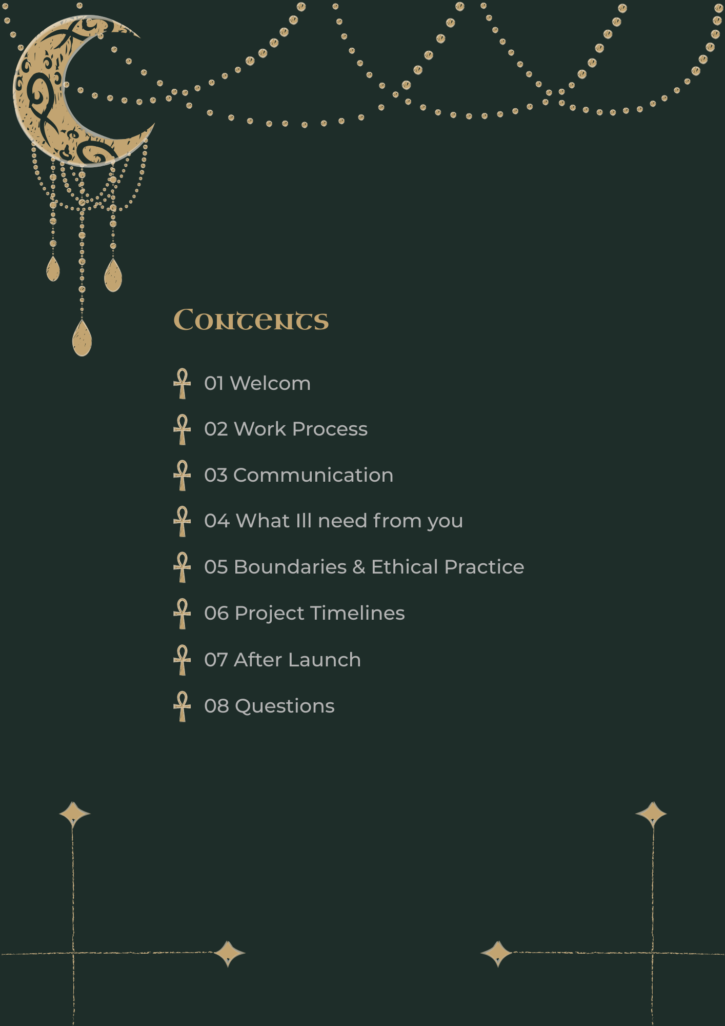
Onboarding Document
Brand Guidelines
What this project shows
Every now and then a project comes along that reminds you exactly why you do this work. Kiri came with a rich, complex, deeply personal brief - lots of elements, lots of meaning, lots of moving parts. The job was to listen carefully, find the thread that connected everything, and build something that felt genuinely hers.
When someone sees their brand for the first time and cries - that's not about the logo. That's about feeling seen.
That's what good branding does.
In Kiri's own words
-
I'm completely in love with it. I'm spending all, of all of my time at the moment. Like, messing with it. Trying to trying to get a feel for how everything goes together in a way that's comfortable for my brain.
All my social media has started going out, so I've got loads of that started, I have literally everybody who has seen my branding has just gone, oh, my God, that's beautiful. and I've gone I know this isn't perfect.
Well, I did like what you said on the presentation as well. where you were like what was it like you you walked into a room and it felt like you were. Yeah, you were home. And it still feels like that. I'm still having that. Oh, this is safe and cozy, and familiar, but also new and exciting. And I'm really, like, let's go, let's go, let's go. But, yeah, safe and familiar and home.
It doesn't feel difficult to use. It doesn't feel unnatural. I look for something that I want particularly doing the the website. I look for an image I want or a pattern I want, and it's there because it's so natural. It's it works with where I am, which is just. It's so much nicer than me sitting there going, I've got to make something else, because I haven't quite got what I want. And then arguing with that for four days because I can't do it.
So have you been finding like the templates. And like the branding guidelines. Okay.
Oh it makes it's making everything so much easier. I don't have, like, the constant headache of how should this work? Like, I don't have to go through and pick, like, six different colors before I can be like, oh, no, that works on that one. I can just look at the thing and go, oh, that's not going to work. Let's try a different option.
The templates are, stunning. I'm currently mid, converting a couple of the pages from the onboarding [document] into a what will eventually be a lead magnet. again, it's like the the hassle of how should this be laid out? How should how am I going to make people not feel overwhelmed by this information is just gone.
I'm just like, okay, I have the content here. Copy paste. Done. it has taken all of the stress out of me trying to do stuff.
I really love that notion board. I really love that process because it it gave me time. And obviously, I've had an amazing experience with it because I did that a couple of times, went backwards and forwards to it. Like, I don't know what to write in this box. Let's go talk to someone else and then come back. And then I did. And I've come to the end of this, and I have a product that is so like you've reached it to a part of a brain of my brain that I didn't know was there and taken this out and gone, here you go found it.
And I'm like, oh, cool. That's amazing. But I don't think you could have done that without me being able to go backwards and forwards on it and figure out exactly how I want to phrase things. So I really love that process.
I really love how communicative you are. Like, I'm very used to people being like, yeah, I'll be done in three weeks and then not hearing from them until that point. So to have like, the little check ins and the like, it's all good. I, I'm working on this, I promise. It was really nice really unexpected like they were really happy little emails for me to get because I was like, oh, oh cool. That's really nice. Now I know you where You are in the process. It takes a lot of the anxiety out of it, especially something that is so personal.
Yeah. Like it takes a lot of the anxiety out of are they going to get am I going to get something I love out of the end of this? Because you obviously care enough to check in?
And yeah, like the your flexibility as well around the number of times I rescheduled meetings. Oh no that’s just life I mean, you can’t that is just that's not a problem at all because life happens.
I mean, in fairness, like, I know I was, I was really anxious to start with, becuase I was like, this is my baby. Yeah. Like, if this goes wrong one, I don't have the disposable income to be able to go and do this again elsewhere. Yeah. Two my business is everything. Yeah. Like it's my life. I can't I had to be certain that I could trust someone with it.
Which is where that notion board really, really helped because the questions were like, okay, no, no, she actually wants to understand what's behind this. Not just I want branding for my business. She actually wants to understand me to be able to make it as me as possible, which gave me a lot of confidence.
whilst I'd seen some of your work and, and loved it because Lexy’s [Alexis Bushnell] stuff was absolutely gorgeous, I was also sat there going okay, but like is this going to work for me? like, is this style, is this this process going to work for me? Because we're very different people.
But no, it worked incredibly, and I was so much more confident once I filled that out because I was like, okay, no there's enough information there that like, you understand me as a person from this,
So I was super anxious, especially as you know, and it's like I do not have the disposable income to go and do that again. So like I, I have been saving for the last two years just to do this. So I'm like, please work, please work, please work.
And then you handed me something which if I had the skill set, I could have probably come up with, but I do not have that skill set. Which was just so, so wonderful to be like, yeah, no, that's me.
Yeah. And as I say, everyone who has looked at it, even people who don't know me that well have gone, oh my God, it's you in branding form. Like it's just you. I don't know how else to describe it. It's just you. And I'm like, I know, and it's perfect and it's incredible. And I'm still crying about it.
so the first thing I did when you sent everything over was I created my discord virtual background, because that's where I spend my time.
And the first thing I did was, okay, well, I've got an idea of how it should look because you did the social media headers, so I just kind of scaled that slightly differently for discord and was like, there we go.
And I showed up on a call with it, didn't tell anyone that I got the final product, didn't do it, just showed up on a call with it.
There was silence for a good three minutes before anyone dared to actually be like, what? Is that behind you? Because that is something. And I'm like, right, it's so pretty.
everyone was just going.
You fit.
Like, I had my synthetics at the time and like, I was fairly gothed up and they're all just going, you you blend in, you fit, it is you. And I'm like, I know. And it's great.
I've put my server together, I've done all my social media and everything, and I'm, I'm so inspired by it, especially because of the Egyptian angle. And that wasn't something I'd considered, which is so dumb considering the name of the business. But it just wasn't an angle I'd ever considered in my branding. Yeah, but I've been so inspired by it. So, like, my server is now the Lionesses Temple. I'm looking at building a membership. Which is just insane. Like, what the hell am I doing? I've got four training courses that I'm building. Yeah, obviously I've got my server builds and upgrades and and that kind of stuff. I've had an ongoing music project that sort of fits in as well because it's all like very calm, meditative, lullaby music under lullaby lioness. So kind of trying to bring that into the kind of temple vibe and like, it's just exploded because I've got this inspiration in front of me that is so perfect for everything that I've ever wanted to do with this business. But now I'm like, well, it'd be a shame to waste it. Do all the things. I can pull my branding into the music stuff and sort of incorporate is another stream of income I can do it for the membership and scale that up a bit. I'm just playing it's work, but I'm playing because it feels so natural to to do.
Yeah. Like I am still at the happy tears every couple of days because it's so perfect. I'm so excited. I'm so, so proud that I took the leap and did it because it's just so perfect. Like I will never be able to say thank you enough because it is just so perfect. it genuinely could not have turned out better. It is just like every I did a, background for my computer screen as well. And every morning I turned on my computer and.
It used to be that I turned on the computer and look at my screen. I go, for fuck's sake, okay, we can do this, you know, now I sit down at my desk, I see my screen, and I'm like, let's go. is the visual representation of what's in my brain. And now, like.
I, I'm not supposed to buy new notebooks because I have too many. since I got my branding back. I filled 3 and I mean, cover to cover with ideas and plans and ways of doing things and what I what I want to do to expand the business. Because.
I can feel it again. Like I can feel my reason for being freelance again, which had disappeared. So like genuinely, it's it's kickstarted so much stuff.
And I was laughing about it yesterday. I was like, I feel like I'm drowning under a pile of spaghetti because every time I pull on one thread, it, it turns out it's three miles long. Yeah, I but also it's really fun to explore just how far some of those ideas can now go when I don't feel held back and like it seems ridiculous. that some pictures on the screen have done all of this, but they have like just like blown everything wide open and given me so much enthusiasm and love for what I do again, which was definitely missing, I am so happy with it. I genuinely I don't have enough words or the right words to say how much I love it. makes me happy every time I look at it, every time I see any element of it, I'm just like, yeah, no, today's a good day.
Seen something that feels like you?
Book a free discovery call and let's talk about what working together could look like.
Still have questions?
Want to know what working with me looks like, or whether a full brand is even right for you? Start here.

Ever wondered what a brand designer actually does all day? Spoiler: it's not just colouring in. Here's a behind-the-scenes look at what really goes into building a brand.
Wondering how long brand design actually takes? Here's a, week-by-week breakdown of the full brand design process, from first conversation to final files.

You used to love working on your branded stuff. Now it feels like a chore. If you're dreading Canva and going in circles - your brand is holding you back.