
Branding for Neurodivergent Business Owners: Making It Work for YOU
Branding can feel like a massive, overwhelming task - especially if you're neurodivergent.
There’s a lot of noise out there about what you 'should' do, but guess what? Your brand doesn’t have to follow the usual rules. It just needs to feel like YOU and attract the people who’ll get you.
Here’s how you can build a visual brand that works for you, not against you.
Choose Colors That Support Your Energy
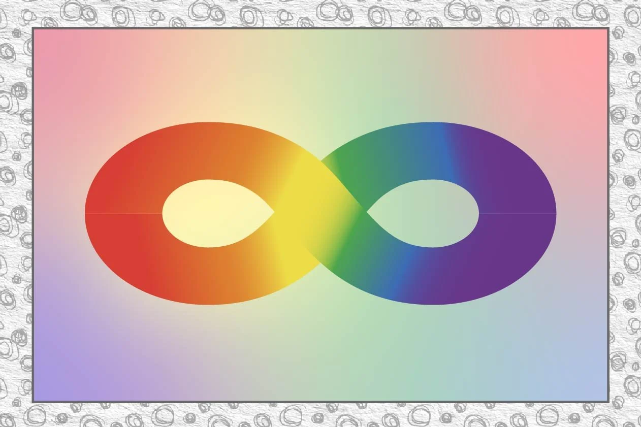
Colours affect mood, so pick a palette that works for you. If bright, high-contrast colours feel overstimulating, go for softer tones.
If muted palettes feel dull, bring in vibrant accent colors. Think about what makes you feel comfortable and confident.
You may even need a combination of bright and soft colours to match how you are feeling on the day - that can work too!
Keep Fonts Simple and Readable
Overly decorative fonts can be hard to read and may cause visual overwhelm.
Stick to 1-2 easy-to-read fonts - one for headlines and one for body text. If certain fonts feel ‘too loud’ or chaotic, swap them for something more structured and calming.
Make Your Logo Work for You
Your logo doesn’t have to be complex. A simple, clear design that represents you is enough. If you find decision-making difficult, start with a text-based logo in a font you love. You can always evolve it later.
Create a Flexible Visual System
Rigid brand rules can feel suffocating, so give yourself room to play. Instead of strict guidelines, think of your brand as a ‘visual toolkit’ - a set of elements - colours, fonts and shapes, that you can mix and match depending on how you feel that day.
Avoid Visual Overwhelm
Too much detail, cluttered layouts, or excessive contrast can make branding feel exhausting. Give your designs breathing space with:
Clean layouts
White space
Consistent design elements
Limited but impactful color use
Use Templates to Make Design Easier
Decision fatigue is real! Set up Canva or another design tool with templates that follow your brand style, so you don’t have to start from scratch every time. Pre-set colors, fonts, and layouts will make it easy to stay consistent without the stress.
I know it’s hard t block the time out to do this, but it is worth it, spread it out over a week or two and work on a set of go to templates that work for you. No more overthinking just choosing the design that fills you with joy on the day.
Let Your Brand Grow with You
Your branding isn’t set in stone. If something stops working for you, change it! Whether it’s a new colour, a fresh layout style, or a simplified design approach, your brand should evolve in a way that supports you, not drains you.
Anything that drains you needs to go in the bin. Working for yourself is hard enough, you don’t want to add to the confusion and stress. If it doesn’t bring you joy it’s time to get rid of it.
The Takeaway
Branding should feel like a comfy, well-worn hoodie - not a stiff, uncomfortable suit. If your brand feels overwhelming, tweak it until it fits you better. Start small: pick one thing (a colour, a font, or a logo tweak) and make it feel more you today.
Need a nudge? What’s one thing about your brand visuals that doesn’t feel quite right? Drop me a message - I’d love to help!