
Blog
More colour freedom than you think
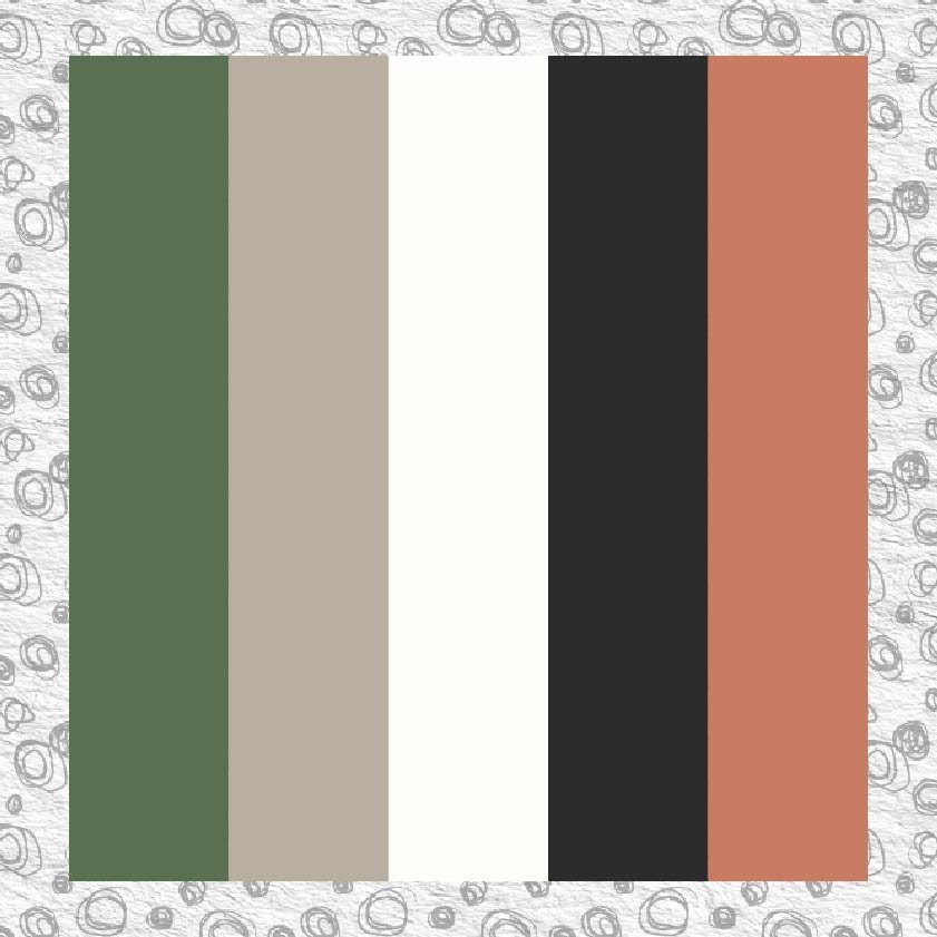
Think you have to limit yourself to five brand colours? Think again. In this blog I'm sharing how to build a colour system that gives you creative freedom and consistency - so your audience starts recognising your content before they've even read a word.

"Professional but Fun"
Stop fighting yourself with mismatched fonts. One versatile font family like Poppins - used strategically across Bold, SemiBold, and Regular weights - plus a balanced color palette creates that elusive "professional but approachable" vibe. Learn the exact proportions and implementation checklist for brands that need to be both credible and friendly.